Semantic Design Token Architecture: Global, Semantic and Component Tokens
How to structure design tokens in three tiers, support themes and multiple brands, and ship them to web, iOS and Android using the W3C DTCG format.
Core Takeaway
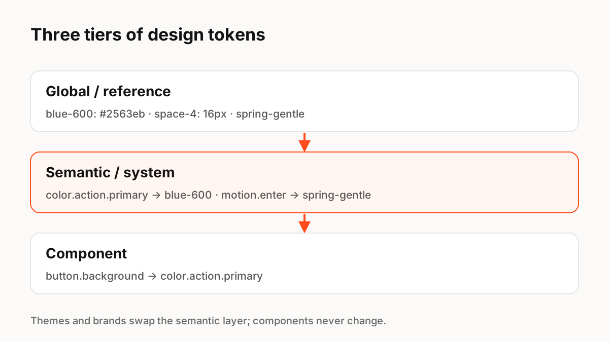
Most mature design systems use three tiers of tokens: global (raw values such as blue-600), semantic (purpose, such as color.action.primary) and component (specific uses, such as button.background). Components reference semantic tokens, semantic tokens reference global ones, and themes or brands swap only the semantic layer. Store them in the W3C DTCG format and generate platform code with a build tool.
The three tiers
Material Design describes three classes of tokens: reference, system and component. Many teams call them global, semantic and component. The names differ, but the idea is the same: separate the raw values from the decisions about how they are used.
- Global (reference): every raw value in the system, such as blue-600, space-4, font-size-16, spring-gentle.
- Semantic (system): what a value is for, such as color.text.primary, color.action.primary, motion.enter.
- Component: how one component uses the system, such as button.background or dialog.motion.open.
Why semantic tokens matter
If a button uses blue-600 directly, every theme change means editing every component. If it uses color.action.primary, dark mode, high contrast or a new brand only change what color.action.primary points to. Material notes that tokens make it possible to apply a high-contrast palette or change the type scale system-wide in exactly this way.
Themes and multiple brands
For multi-brand or white-label products, keep one set of semantic and component tokens and one global palette per brand. Each theme is a mapping from semantic tokens to global values. The first stable version of the W3C Design Tokens specification (2025.10), released in October 2025, added theming and multi-brand support, modern colour spaces such as Display P3 and OKLCH, and aliases and component-level references.
Motion tokens belong here too
Durations, easing curves and springs follow the same tiers. A global token might be spring-gentle with its stiffness and damping; a semantic token motion.enter points to it; a component token sheet.motion.open points to motion.enter. Add a reduced-motion theme that remaps motion tokens to short fades.
Shipping tokens to every platform
Keep tokens in a repository as DTCG JSON, the single source of truth. A build tool such as Style Dictionary transforms them into CSS variables, Swift, Kotlin, Flutter or other formats. Design tools that read the same format can stay in sync, and AI coding tools can read the JSON directly.
- Source of truth: DTCG JSON in Git, reviewed like code
- Build: transform to each platform on every change
- Design tool sync: import or plugin, never hand-copied values
- Linting: forbid raw values in components
Key Principles to Remember
- Three tiers: global (values), semantic (purpose), component (usage)
- Components reference semantic tokens, never raw values
- Themes and brands remap the semantic layer
- The W3C DTCG format reached its first stable version (2025.10) in October 2025
- Include motion tokens and a reduced-motion theme
Frequently Asked Questions
Sources
- Design tokens overview — Material Design 3
- Design Tokens specification reaches first stable version — W3C Design Tokens Community Group
- Design Tokens Community Group — designtokens.org
- Style Dictionary — styledictionary.com