
Menus & navigation
Swatch fan colour menu
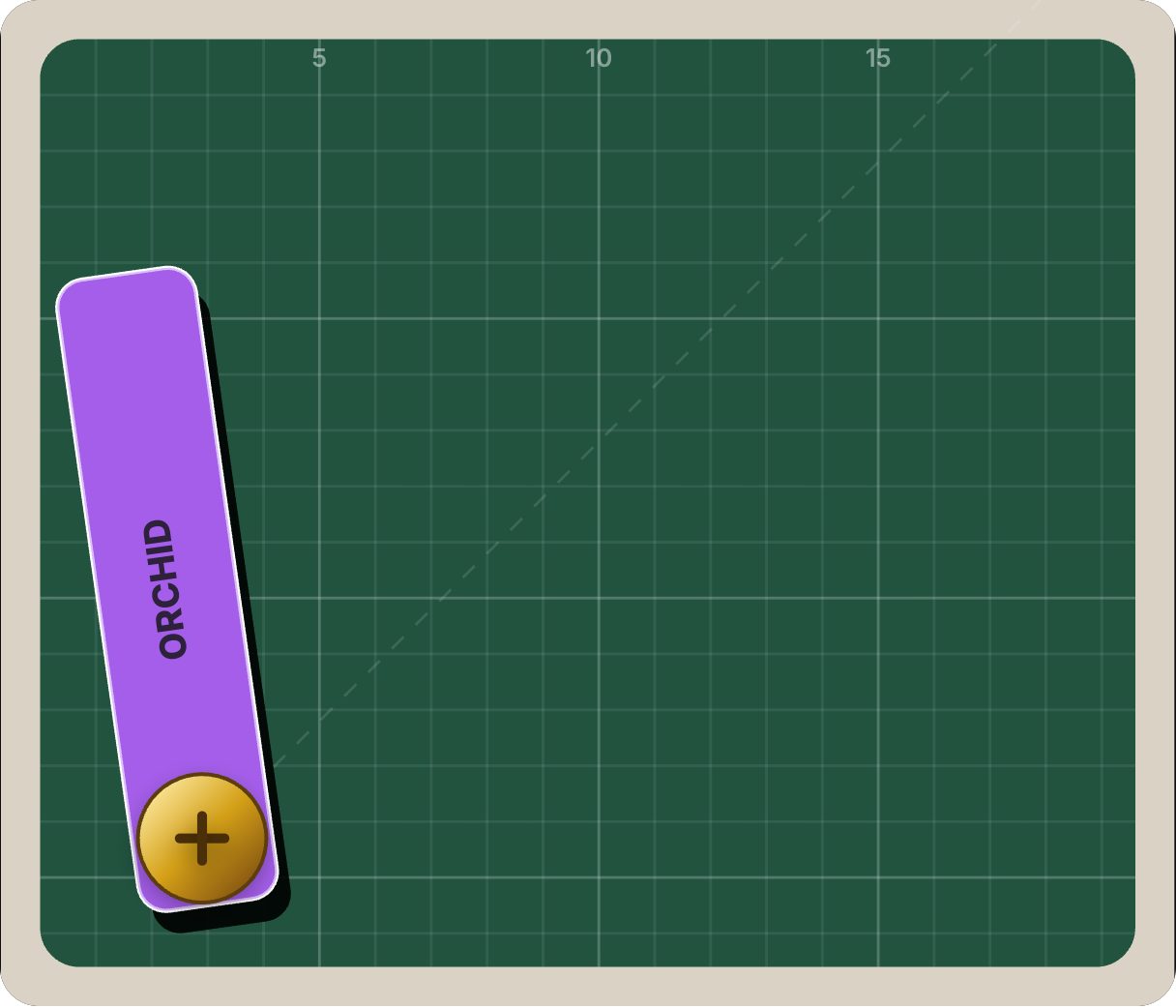
A designer's swatch book that fans open — Coral, Tangerine, Mustard, Mint, Azure, Orchid. Use it as a colour or theme picker, or as a menu for design-led brands, paint and interiors, and creative studios.
- 8.9 KB compiled
- 420 × 360 artboard
- 1 input
- 9 runtimes
Live
How it works
- isOpen opens and closes the fan.
- Swatches rotate out from a shared pivot into a fan.
- Each swatch plays a lift animation when clicked.
| Input | Type | What it does |
|---|---|---|
isOpen | Boolean | Fans the swatches open (true) or stacks them (false). |
When to use it
- Theme and colour pickers
- Paint, interiors and fashion retail
- Design-studio portfolios
Accessibility
Always show colour names (already in the file) — never rely on colour alone to identify an option.
Also searched as: color picker animation · swatch book menu · theme picker
Use it in your app
One component, one file. Pick your stack:
import { ExodeUICanvas } from 'exodeui';

export function SwatchFanColorMenu() {
  return (
    <ExodeUICanvas
      src="/swatch-fan-menu.bexode"
      autoPlay
      onReady={(engine) => {
        // drive it from your own UI:
        // engine.setInputBool('isOpen', true);
      }}
    />
  );
}
React loads the compact .bexode; the other runtimes load the .exode JSON source — both come from the same design.
Questions
Can it act as a real colour picker?
Yes. Listen for the swatch clicks in your app and apply the matching theme.
Can I change the colour names?
They are editable text objects in the file.
More menus & navigation



Make it yours in ExodeUI.
Change the colours, the timing, the logic — then ship the same file.