Sketch UI Components

These 72 free sketch UI components are buttons, inputs, menus, dialogs, charts and widgets drawn by hand: wobbly ink outlines, marker fills and handwritten type. Each one is a real interactive component, not a picture. Tap or hover a card to try it, then open it in ExodeUI to change it or download the .exode file.

Updated November 2026

Hover and press
Buttons

Buttons

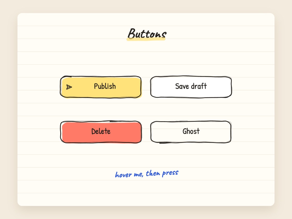
Four hand-drawn buttons: primary, outline, danger and ghost. Hover lifts them, a press squashes them.

Hover to play
Buttons

Loading button

Submit turns into a scribbled spinner, then the fill goes green and a tick draws itself. Tap again to reset.

Hover to play
Buttons

Like button

The heart squashes, fills with red marker and throws a little burst; the count goes up by one.

Hover to play
Buttons

Copy button

Copy flips to a green Copied! with a drawn tick, then settles back on its own.

Hover to play
Buttons

Floating action button

The + turns into an × and three labelled actions spring out of it one after another.

Hover to play
Buttons

Download button

A green marker fills the button while the percentage counts to 100, then it says Saved!.

Hover to play
Buttons

Delete with confirm

Delete asks Sure? first. Yes scribbles a red cross over the file; tap the file to undo.

Hover to play
Buttons

Icon toolbar

A blue pen loop glides to the tapped tool and its handwritten label appears below.

Hover to play
Buttons

Follow button

Follow becomes Following with a tick and the follower count ticks up. Tap again to unfollow.

Hover to play
Inputs

Switches

Three settings switches. The knob stretches as it slides and the track fills with green marker.

Hover to play
Inputs

Checkbox list

A to-do list: a tick draws into the box and a red pen strikes the task through.

Hover to play
Inputs

Radio group

Pick a plan: the dot moves and a blue pen loop glides around the chosen card.

Hover to play
Inputs

Segmented control

A yellow marker slides to Day, Week or Month and the big number below crossfades.

Hover to play
Inputs

Slider

A real slider: the marker fill, the percentage and the speaker waves follow the knob.

Hover to play
Inputs

Text field

A real text field. What you type is written onto a HELLO my name is sticker as you type.

Hover to play
Inputs

Password field

The eye shows and hides the password; a three-part marker meter rates its length.

Hover to play
Inputs

Number stepper

The digit rolls like an odometer and a row of doodled coffee cups fills in. It stops at 0 and 5.

Hover to play
Inputs

Star rating

Stars fill with yellow marker one after another up to the one you tap, and a word says how it went.

Hover to play
Inputs

Color swatches

Tap a swatch: the pen loop moves to it and the doodled bird is repainted in that colour.

Hover to play
Inputs

Toggle chips

Eight interest chips. Each one fills yellow and draws a tick when picked.

Hover to play
Inputs

Select menu

The menu drops open under the field; picking a fruit moves the tick, closes the menu and fills the field.

Hover to play
Inputs

Date picker

A November calendar: the yellow disc glides to the day you tap and the line below names it.

Hover to play
Navigation

Tabs

A red marker underline slides under the tapped tab and the panel below crossfades and settles.

Hover to play
Navigation

Bottom tab bar

A yellow blob glides behind the active icon; the label lights up and the screen title swaps.

Hover to play
Navigation

Breadcrumb

Tap a crumb to go back up: the trail after it fades, the marker moves and the page swaps.

Hover to play
Navigation

Pagination

Numbers and arrows move the yellow square; the page of results slides in from the side it came from.

Hover to play
Navigation

Sidebar menu

Hover draws a blue pen line under an item; a tap moves the yellow highlight and changes the page.

Hover to play
Navigation

Hamburger menu

The three lines fold into an × and a yellow menu drops in, its links arriving one by one.

Hover to play
Navigation

Step wizard

Next draws the connector, ticks the finished step and slides the next step in. Back undoes it.

Hover to play
Navigation

Dropdown menu

The ⋯ button opens a menu that pops out with its items arriving in turn; tap anywhere to close.

Hover to play
Navigation

Accordion

Tap a question: the answer opens in blue pen, the chevron turns and the rows below move down.

Hover to play
Overlays

Modal dialog

The page dims and a confirm dialog springs in with a small twist; Cancel or a tap outside closes it.

Hover to play
Overlays

Toasts

A toast springs up from the bottom and hides itself after two seconds. The error one shakes.

Hover to play
Overlays

Tooltips

Hover a tool and its ink tooltip pops up above it with a small spring.

Hover to play
Overlays

Popover

Tap a teammate: a profile popover grows out of them with an arrow. Tap outside to close.

Hover to play
Overlays

Bottom sheet

A share sheet springs up from the bottom of the phone over a dimmed photo; tap outside to drop it.

Hover to play
Overlays

Alerts

Info, success and warning alerts. × flings one away; Bring them back slides them in again.

Hover to play
Overlays

Context menu

Tap the shape: a pen loop circles it and a menu with shortcuts pops out beside it.

Hover to play
Feedback

Progress bar

A green marker fills the bar with a realistic stall in the middle while the percentage counts; all done! pops at the end.

Hover to play
Feedback

Progress ring

The red ring sweeps to 25, 60 or 100 percent and the number in the middle counts along with it.

Hover to play
Feedback

Loaders

Four looping loaders: a scribble spinner, bouncing marker dots, a squiggle that writes itself and a flipping hourglass.

Hover to play
Feedback

Skeleton loader

Hatched pencil placeholders pulse, then the real profile fades in and settles. Reload plays it again.

Hover to play
Feedback

Empty state

A floating empty box with a fly says nothing is here yet; Create project swaps it for the first card.

Hover to play
Feedback

Success check

The ring draws itself, fills green, a big tick lands, sparkles spin and the amount counts up.

Hover to play
Feedback

Form error

Sign up shakes the field, turns it red and underlines the typo. Use it fixes the email and ticks it.

Hover to play
Feedback

Notification badge

Each new message pops the red badge up by one and rings the bell; Read all empties it.

Hover to play
Feedback

Notifications

The bell rings, its dot clears and a panel drops down with three notifications sliding in.

Hover to play
Feedback

File upload

Three files slide into the list, each bar fills with marker at its own speed and ends with a tick.

Hover to play
Data display

Hover cards

Three tilted trip cards. Hover one and it straightens, lifts, grows a little and shows an arrow.

Hover to play
Data display

Pricing toggle

Monthly / Yearly: the prices roll to the new amount, the billing line changes and a save 20%! note pops in.

Hover to play
Data display

Avatar group

A stack of doodled faces fans out on hover; names pop in under each one and a +3 chip slides in.

Hover to play
Data display

Swipe inbox

Each tap swipes the top mail away and the rest move up. After the last one: Inbox zero! Tap again to refill.

Hover to play
Data display

Table

An invoice table with coloured status pills; hovering a row sweeps a yellow highlighter across it.

Hover to play
Data display

Bar chart

Hatched bars grow to the other year one after another with a bounce, and the pen loop moves to the year.

Hover to play
Data display

Line chart

The blue line draws itself point by point; Show coffee draws a second red line over it.

Hover to play
Data display

Timeline

The rail draws down the page and each event pops onto it in turn, sliding its card in from the right.

Hover to play
Data display

Kanban board

The card lifts, tilts and swings to the next column. In Done it turns green and gets a tick.

Hover to play
Data display

Chat

Your message and picture pop in, the typing dots bounce, then the reply springs up.

Hover to play
Data display

Reactions

Each reaction chip fills with colour, its icon jumps and twists, and the count goes up by one.

Hover to play
Data display

Stat cards

Three numbers count up with an ease-out and a small sparkline draws itself under each.

Hover to play
Widgets

Music player

Play spins the record and runs the progress line; the icon swaps to pause. Tap again to stop.

Hover to play
Widgets

Weather card

Tap through sunny, cloudy and rain: the cloud slides over the sun, rain starts falling and the temperature rolls.

Hover to play
Widgets

Countdown

A ten-second countdown: the red ring unwinds, the rocket shakes at one and blasts off on Go!.

Hover to play
Widgets

Quiz card

A wrong answer shakes and gets a red cross; the right one bumps, turns green and gets a tick.

Hover to play
Widgets

Sticky notes

Taped sticky notes on a wall. Tap one and it straightens, comes forward and grows; tap again to put it back.

Hover to play
Widgets

Theme toggle

The sun rolls out and the moon rolls in, the page goes dark and stars pop in one by one.

Hover to play
Widgets

Login form

Two real fields. Sign in spins, the form lifts away and a welcome card springs in. Tap it to sign out.

Hover to play
Widgets

Keyboard shortcuts

Hand-drawn keycaps press in turn to play ⌘K, ⌘Z and ⌘⇧S, with a caption for each shortcut.

Hover to play
Widgets

Map with pins

Pins drop onto a doodled map; tap one and it grows while an info card slides up with its name.

What makes a UI component look hand-drawn

Three things carry most of the sketch look. Outlines are not perfect shapes: every edge wobbles a little, overshoots where the pen would, and gets a fainter second pass. Fills are like marker, set a few pixels off the line so the colour does not quite match the outline. Text uses handwriting, with a bolder hand for titles and a neat print hand for labels.

Motion adds the rest. In this set the outlines draw themselves when a component loads, ticks and underlines are written in with the stroke, and the blue pen notes shift slightly a few times a second, like frames of a flipbook. Every shape is a vector path, so the components stay sharp at any size.

When to use sketchy UI

Prototypes that look unfinished on purpose

A rough look tells reviewers the design is still open, so feedback goes to the flow and not the pixels. Unlike a static wireframe, these already move and respond.

Playful brands and side projects

Journaling apps, games, kids’ learning, creative tools and personal sites can use the hand-drawn style as their real interface.

Onboarding, empty states and success screens

A sketched moment inside a clean product feels friendly without changing the rest of the design.

Teaching and explainers

Hand-drawn components read like notes in a notebook, which works well for tutorials and course material.

All 72 hand-drawn UI components

Buttons (9)

  • Buttons: Four hand-drawn buttons: primary, outline, danger and ghost. Hover lifts them, a press squashes them.
  • Loading button: Submit turns into a scribbled spinner, then the fill goes green and a tick draws itself. Tap again to reset.
  • Like button: The heart squashes, fills with red marker and throws a little burst; the count goes up by one.
  • Copy button: Copy flips to a green Copied! with a drawn tick, then settles back on its own.
  • Floating action button: The + turns into an × and three labelled actions spring out of it one after another.
  • Download button: A green marker fills the button while the percentage counts to 100, then it says Saved!.
  • Delete with confirm: Delete asks Sure? first. Yes scribbles a red cross over the file; tap the file to undo.
  • Icon toolbar: A blue pen loop glides to the tapped tool and its handwritten label appears below.
  • Follow button: Follow becomes Following with a tick and the follower count ticks up. Tap again to unfollow.

Inputs (14)

  • Switches: Three settings switches. The knob stretches as it slides and the track fills with green marker.
  • Checkbox list: A to-do list: a tick draws into the box and a red pen strikes the task through.
  • Radio group: Pick a plan: the dot moves and a blue pen loop glides around the chosen card.
  • Segmented control: A yellow marker slides to Day, Week or Month and the big number below crossfades.
  • Slider: A real slider: the marker fill, the percentage and the speaker waves follow the knob.
  • Text field: A real text field. What you type is written onto a HELLO my name is sticker as you type.
  • Password field: The eye shows and hides the password; a three-part marker meter rates its length.
  • Search with suggestions: Type into the real field: fruit chips that do not match fade back and the count updates.
  • Number stepper: The digit rolls like an odometer and a row of doodled coffee cups fills in. It stops at 0 and 5.
  • Star rating: Stars fill with yellow marker one after another up to the one you tap, and a word says how it went.
  • Color swatches: Tap a swatch: the pen loop moves to it and the doodled bird is repainted in that colour.
  • Toggle chips: Eight interest chips. Each one fills yellow and draws a tick when picked.
  • Select menu: The menu drops open under the field; picking a fruit moves the tick, closes the menu and fills the field.
  • Date picker: A November calendar: the yellow disc glides to the day you tap and the line below names it.

Navigation (10)

  • Tabs: A red marker underline slides under the tapped tab and the panel below crossfades and settles.
  • Bottom tab bar: A yellow blob glides behind the active icon; the label lights up and the screen title swaps.
  • Breadcrumb: Tap a crumb to go back up: the trail after it fades, the marker moves and the page swaps.
  • Pagination: Numbers and arrows move the yellow square; the page of results slides in from the side it came from.
  • Sidebar menu: Hover draws a blue pen line under an item; a tap moves the yellow highlight and changes the page.
  • Hamburger menu: The three lines fold into an × and a yellow menu drops in, its links arriving one by one.
  • Step wizard: Next draws the connector, ticks the finished step and slides the next step in. Back undoes it.
  • Dropdown menu: The ⋯ button opens a menu that pops out with its items arriving in turn; tap anywhere to close.
  • Accordion: Tap a question: the answer opens in blue pen, the chevron turns and the rows below move down.
  • Card carousel: Polaroid-style doodle cards slide with a little overshoot, the centre card grows and the dots follow.

Overlays (8)

  • Modal dialog: The page dims and a confirm dialog springs in with a small twist; Cancel or a tap outside closes it.
  • Toasts: A toast springs up from the bottom and hides itself after two seconds. The error one shakes.
  • Tooltips: Hover a tool and its ink tooltip pops up above it with a small spring.
  • Popover: Tap a teammate: a profile popover grows out of them with an arrow. Tap outside to close.
  • Bottom sheet: A share sheet springs up from the bottom of the phone over a dimmed photo; tap outside to drop it.
  • Alerts: Info, success and warning alerts. × flings one away; Bring them back slides them in again.
  • Context menu: Tap the shape: a pen loop circles it and a menu with shortcuts pops out beside it.
  • Cookie banner: Accept takes a bite out of the cookie and the banner drops away; the settings link brings it back.

Feedback (10)

  • Progress bar: A green marker fills the bar with a realistic stall in the middle while the percentage counts; all done! pops at the end.
  • Progress ring: The red ring sweeps to 25, 60 or 100 percent and the number in the middle counts along with it.
  • Loaders: Four looping loaders: a scribble spinner, bouncing marker dots, a squiggle that writes itself and a flipping hourglass.
  • Skeleton loader: Hatched pencil placeholders pulse, then the real profile fades in and settles. Reload plays it again.
  • Empty state: A floating empty box with a fly says nothing is here yet; Create project swaps it for the first card.
  • Success check: The ring draws itself, fills green, a big tick lands, sparkles spin and the amount counts up.
  • Form error: Sign up shakes the field, turns it red and underlines the typo. Use it fixes the email and ticks it.
  • Notification badge: Each new message pops the red badge up by one and rings the bell; Read all empties it.
  • Notifications: The bell rings, its dot clears and a panel drops down with three notifications sliding in.
  • File upload: Three files slide into the list, each bar fills with marker at its own speed and ends with a tick.

Data display (12)

  • Hover cards: Three tilted trip cards. Hover one and it straightens, lifts, grows a little and shows an arrow.
  • Pricing toggle: Monthly / Yearly: the prices roll to the new amount, the billing line changes and a save 20%! note pops in.
  • Avatar group: A stack of doodled faces fans out on hover; names pop in under each one and a +3 chip slides in.
  • Swipe inbox: Each tap swipes the top mail away and the rest move up. After the last one: Inbox zero! Tap again to refill.
  • Table: An invoice table with coloured status pills; hovering a row sweeps a yellow highlighter across it.
  • Bar chart: Hatched bars grow to the other year one after another with a bounce, and the pen loop moves to the year.
  • Line chart: The blue line draws itself point by point; Show coffee draws a second red line over it.
  • Timeline: The rail draws down the page and each event pops onto it in turn, sliding its card in from the right.
  • Kanban board: The card lifts, tilts and swings to the next column. In Done it turns green and gets a tick.
  • Chat: Your message and picture pop in, the typing dots bounce, then the reply springs up.
  • Reactions: Each reaction chip fills with colour, its icon jumps and twists, and the count goes up by one.
  • Stat cards: Three numbers count up with an ease-out and a small sparkline draws itself under each.

Widgets (9)

  • Music player: Play spins the record and runs the progress line; the icon swaps to pause. Tap again to stop.
  • Weather card: Tap through sunny, cloudy and rain: the cloud slides over the sun, rain starts falling and the temperature rolls.
  • Countdown: A ten-second countdown: the red ring unwinds, the rocket shakes at one and blasts off on Go!.
  • Quiz card: A wrong answer shakes and gets a red cross; the right one bumps, turns green and gets a tick.
  • Sticky notes: Taped sticky notes on a wall. Tap one and it straightens, comes forward and grows; tap again to put it back.
  • Theme toggle: The sun rolls out and the moon rolls in, the page goes dark and stars pop in one by one.
  • Login form: Two real fields. Sign in spins, the form lifts away and a welcome card springs in. Tap it to sign out.
  • Keyboard shortcuts: Hand-drawn keycaps press in turn to play ⌘K, ⌘Z and ⌘⇧S, with a caption for each shortcut.
  • Map with pins: Pins drop onto a doodled map; tap one and it grows while an info card slides up with its name.

How to add a sketch component to your site

  1. Pick a component. Open it in ExodeUI to change the text, colours or fonts, or keep it as it is.
  2. Download the .bexode file and put it in your public folder.
  3. Install the runtime with npm i exodeui.
  4. Render it with ExodeUICanvas. Taps and hovers already work, and fireTrigger plays a state from your code.
import { ExodeUICanvas, useExodeUI } from 'exodeui';

export function LikeButton() {
  const { setEngine, fireTrigger } = useExodeUI();

  return (
    <>
      <div style={{ width: 400, height: 300 }}>
        <ExodeUICanvas
          src="/sketch-ui/files/sk-like-button.bexode"
          autoPlay
          onReady={setEngine}
          style={{ width: '100%', height: '100%' }}
        />
      </div>
      {/* Optional: taps on the canvas already work */}
      <button onClick={() => fireTrigger('in_like')}>Like from code</button>
    </>
  );
}

You can also ask an AI coding tool for a new one. ExodeUI has an MCP server, so Claude Code, Cursor and similar tools can create and edit .exode animations from a plain-language prompt, such as “a hand-drawn toggle that fills with green marker”.

Other ways to get a hand-drawn UI look

We make ExodeUI, so weigh this with that in mind. If you only need static sketchy shapes in your own canvas or SVG code, Rough.js is a small MIT-licensed library that draws lines, curves and shapes in a hand-drawn style. For diagrams and whiteboard wireframes, Excalidraw is an open-source whiteboard with the same look. For low-fidelity wireframes and click-through prototypes that a team reviews together, Balsamiq is built for that job. ExodeUI fits when the sketch style is part of a shipped interface, with states, taps and animation that your app controls.

Frequently asked questions

What are sketch UI components?
They are the usual parts of an interface, such as buttons, switches, tabs, dialogs and charts, drawn in a hand-made style: wobbly ink outlines, marker fills and handwritten fonts. The ones on this page also work. They react to taps and hovers and move between states.
Are these hand-drawn UI components free?
Yes. All 72 can be tried here, downloaded as .exode files and opened in ExodeUI on the free Community plan. The names, prices and messages inside them are sample content.
Can I use them in a real product?
Yes. Each one plays in your app through the ExodeUI runtime (npm package exodeui for React, with runtimes for Vue, Svelte, Angular, Solid, React Native, SwiftUI and Flutter). Your own code still does the real work, such as saving a setting or sending a message. The component shows the state.
Which fonts do the sketch components use?
Titles and notes use Caveat and the interface text uses Patrick Hand. Both are free Google Fonts, and the runtime loads them by name. You can swap in any other font in the editor.
Can my code control a sketch component?
Yes. Taps and hovers work out of the box. To play a state from your code, call fireTrigger with the trigger input id, for example in_like for the like button. Use the id rather than the name.
Is a sketchy style good for production UI?
It suits playful brands, education, kids’ products, onboarding, empty states and early prototypes. For dense tools such as dashboards that people use all day, a clean style is easier to read. A common middle ground is a clean product with a few sketched moments.