
Characters & mascots
Mood meter slider
Move across it and the face changes with you — from sad, to meh, to yay — with the label and colours following. It is an emoji rating scale that people actually enjoy using, which tends to mean more honest feedback.
- 42.8 KB compiled
- 410 × 310 artboard
- No inputs
- 9 runtimes
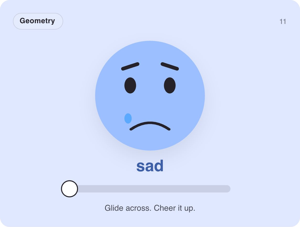
No inputs — move your pointer across it.
How it works
- The Mood layer blends sad, meh and yay poses from the pointer's horizontal position — no input needed.
- The slider thumb and the label update together with the face.
- An Ambient layer adds a gentle bob.
When to use it
- Feedback and NPS surveys
- Mood check-ins in wellness apps
- Post-purchase ratings
Accessibility
Back it with a real range input (with aria-valuetext like "meh") so ratings work from the keyboard.
Also searched as: emoji rating slider · feedback slider · mood tracker
Use it in your app
One component, one file. Pick your stack:
import { ExodeUICanvas } from 'exodeui';

export function MoodMeterSlider() {
  return (
    <ExodeUICanvas
      src="/gallery-11-mood-meter.bexode"
      autoPlay
      onReady={(engine) => {
        // drive it from your own UI:
        // // No inputs: it reacts to the pointer on its own.
      }}
    />
  );
}
React loads the compact .bexode; the other runtimes load the .exode JSON source — both come from the same design.
Questions
How does it read the value?
It is driven by pointer position; pair it with a range input in your app to store the rating.
Can I add more moods?
Yes — add poses to the blend in the Mood layer.
More characters & mascots

Make it yours in ExodeUI.
Change the colours, the timing, the logic — then ship the same file.