1
Star Rating React radio button
Pickers

Stars up to the choice fill in. Our first pick: a pickers radio group with 5 inputs your React code can drive, in a 722-byte file.
React · Radio groups · Updated November 2026
Need a React radio button component with real motion? These five animated radio buttons play in React from one .exode file, chosen from the 50 in Exode Galleries. Each one is live below: try it, then open it in ExodeUI and drop it into your React app with the code at the end.
Pickers
Stars up to the choice fill in. Our first pick: a pickers radio group with 5 inputs your React code can drive, in a 722-byte file.
Segmented
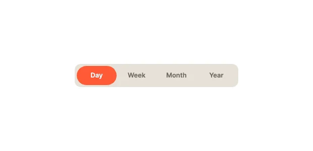
The highlight stretches like goo as it moves. It is a segmented radio group with 5 inputs your React code can drive, in a 729-byte file.
Pickers
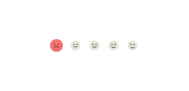
Faces from sad to happy; the chosen one grows. It is a pickers radio group with 5 inputs your React code can drive, in a 740-byte file.
Cards
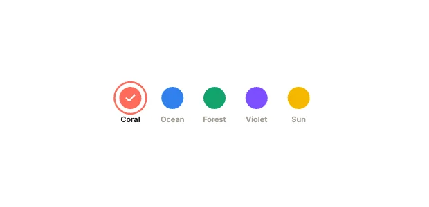
Swatches that ring the chosen colour. It is a cards radio group with 5 inputs your React code can drive, in a 746-byte file.
Motion
A blob drips from one ring to the next. It is a motion radio group with 5 inputs your React code can drive, in a 727-byte file.
Use it as a checklist when you compare the picks above. Each one is a native radio group in ExodeUI, so whatever is missing you change in the editor instead of rewriting React code.
| # | Design | Category | Inputs | File |
|---|---|---|---|---|
| 1 | Star Rating | Pickers | 5 | 722 B |
| 2 | Gooey | Segmented | 5 | 729 B |
| 3 | Mood Faces | Pickers | 5 | 740 B |
| 4 | Colour Swatches | Cards | 5 | 746 B |
| 5 | Liquid Blob | Motion | 5 | 727 B |
The code for #1, Star Rating, with its real file and input names. Every pick works the same way.
npm install exodeuiimport { useEffect } from 'react';
import { ExodeUICanvas, useExodeUI } from 'exodeui';
export function RdStars() {
const { engine, setEngine, updateInput, fireTrigger } = useExodeUI();
useEffect(() => {
updateInput("Star Rating · Selected", "Hello");
}, [engine]);
return (
<>
<ExodeUICanvas src="/rd-stars.bexode" onReady={setEngine} />
</>
);
}Pick a design here, open it in ExodeUI and change it, then export a .bexode file. Install exodeui (npm install exodeui) and load the file with the runtime; the code below uses the first pick’s real file and input names. The motion, states and springs live in the file, so your React code only sets and reads inputs.
It depends on the job: Star Rating (pickers), Gooey (segmented), Mood Faces (pickers) cover different styles. These five are our picks from the 50 radio groups in Exode Galleries, chosen for range, for how much is wired to inputs and for how well they read small. They are not a survey of other libraries.
They replace it where you want custom motion. Keep the built-in one where the platform default is right, and use an ExodeUI file where the radio button is part of your brand.
Yes. They come from Radio Group Studio, built into the ExodeUI editor and included in the free Community plan. The React runtime is free too.
Yes. Open one in ExodeUI and every part is a native layer: colours, type, motion and logic. The input names stay the same, so your code keeps working.
Free to start. Every studio behind this library is built into the editor, and everything it makes stays native and editable.
Try ExodeUI for free