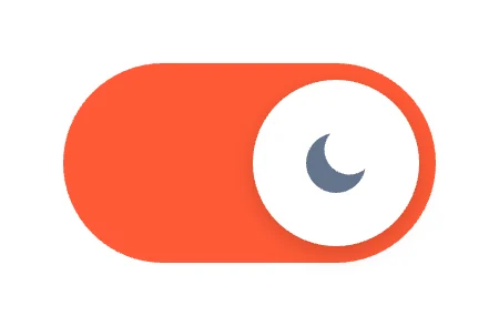
Sun / MoonIcon Morph
Free · Live demos · Updated November 2026
Free dark mode toggle
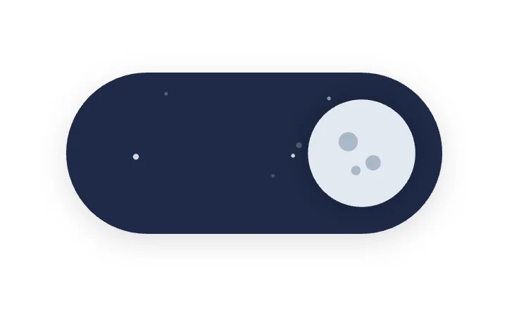
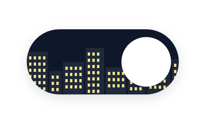
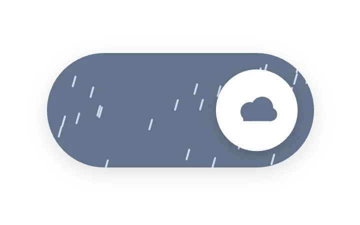
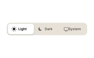
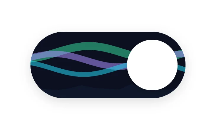
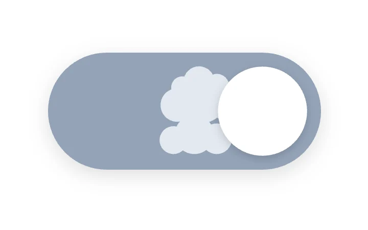
Here are 8 free animated dark mode toggles: a sun that pulls in its rays and becomes a moon, a sky that turns from day to night, a skyline that lights up, and a three-way Light, Dark and System picker. Each one is live below. The state is an input (On, or a 0 to 2 State for the three-way picker), so your app sets it from the saved theme and listens when the user taps.
A theme toggle is seen on every page, so it is one of the few places where a little character pays off.
We make ExodeUI. Every component on this page comes from our own library.
Try them live 8
Every component below is running. Drag, tap or type to try it, then open it in ExodeUI or see its inputs and code.
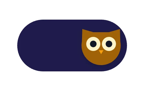
OwlCharacters
What to look for in a dark mode toggle
- The icon tells you the current theme at a glance.
- A System option, if your app follows the OS setting.
- Its state comes from your saved theme on load, with no flash.
- It is at least 44 px tall so it is easy to tap.
Use it in your app
The code for Sun / Moon, with its real file and input names. Every component on this page works the same way.
npm install exodeuiimport { useEffect } from 'react';
import { ExodeUICanvas, useExodeUI } from 'exodeui';
export function IconSunMoon() {
const { engine, setEngine, updateInput, fireTrigger } = useExodeUI();
useEffect(() => {
updateInput("Sun / Moon · On", true);
}, [engine]);
return (
<>
<ExodeUICanvas src="/icon-sun-moon.bexode" onReady={setEngine} />
</>
);
}Questions
Is this dark mode toggle free?
Yes. Every design comes from a studio built into the ExodeUI editor, and the studios are part of the free Community plan. You can open and change any design without a paid plan, or download its .exode file from its page. The runtimes are free npm, Swift and Flutter packages.
How do I connect it to my theme?
Set the toggle’s On input (or State on the Theme Picker) from your saved theme when the page loads, and listen for changes to switch the theme. The code block on this page shows the input names.
Do I need a System option?
If your app follows the operating system theme, yes. The Theme Picker design has Light, Dark and System.
Which frameworks does it work in?
Each design is one .exode file. The ExodeUI runtimes play the same file in React, Vue, Svelte, Angular, Solid, React Native, SwiftUI and Flutter, and the inputs have the same names in all of them.
Can I change the colours?
Yes. Open it in ExodeUI and every part is a native layer: colours, type, motion curves, springs and logic. The input names stay the same, so code that already uses the design keeps working.
Related
More free components
- Animated UI components
- Interactive UI components
- Animated elements for websites
- Animated React components
- Micro-interactions
- Animated form components
- Star rating
- Segmented control
- Range slider
- Knobs and dials
- Floating label input
- OTP input
- Password input
- Search bar
- Image carousel
- Donut chart
- Line chart
- Pricing table
- Liquid glass UI kit
Make your own in ExodeUI
Free to start. Every studio behind these components is built into the editor, and everything it makes stays native and editable.
Try ExodeUI for free