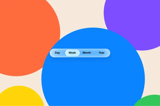
Segmented controlLiquid glass component · Controls
Free · Live demos · Updated November 2026
Free segmented control
These 22 free segmented controls move a highlight between options: a sliding pill, a stretching underline, a gooey blob, a glass thumb and more, plus ready-made switches for billing period, view and theme. Each one is live below. The selected option is an input your app reads and sets.
A segmented control is for two to five options that change the view right away. For more options, a dropdown is usually better.
We make ExodeUI. Every component on this page comes from our own library.
Try them live 22
Every component below is running. Drag, tap or type to try it, then open it in ExodeUI or see its inputs and code.
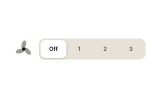
Fan SpeedToggle · Segmented & Multi-State
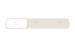
Text AlignToggle · Segmented & Multi-State
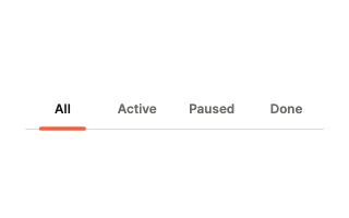
Tab PillToggle · Segmented & Multi-State
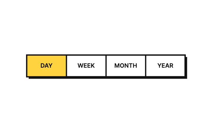
Brutal SegmentsRadio group · Segmented
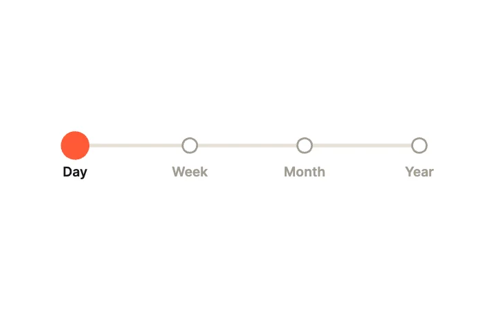
Dot StepsRadio group · Segmented
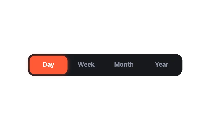
Dark SegmentsRadio group · Segmented
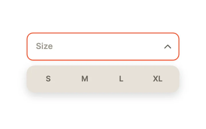
Segmented PopoverDropdown · Pickers
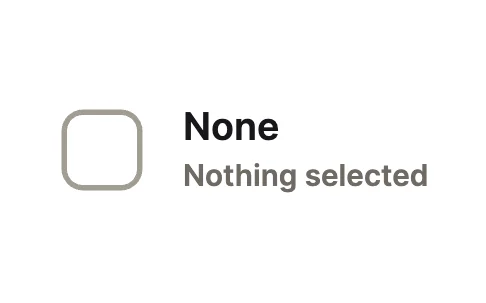
Tri-State CheckToggle · Segmented & Multi-State
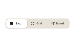
View SwitcherToggle · Segmented & Multi-State
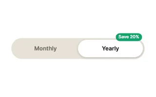
Billing PeriodToggle · Segmented & Multi-State
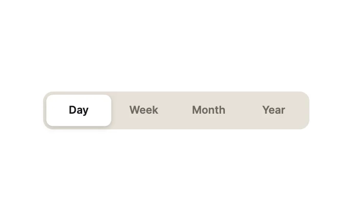
Segmented PillRadio group · Segmented
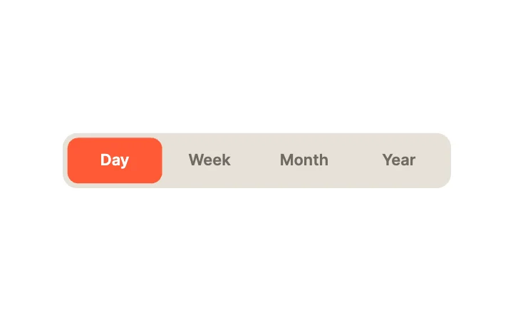
Accent FillRadio group · Segmented
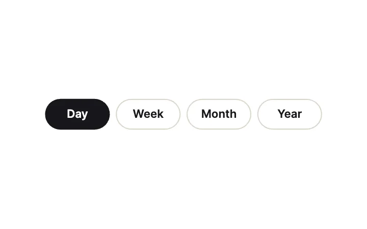
ChipsRadio group · Segmented
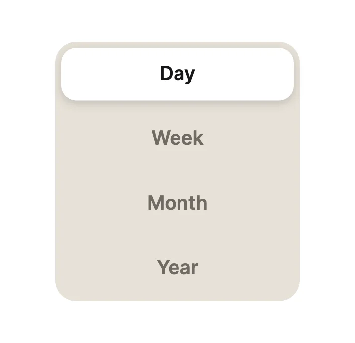
Vertical PillsRadio group · Segmented
Three-WayToggle · Segmented & Multi-State
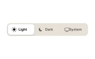
Theme PickerToggle · Segmented & Multi-State
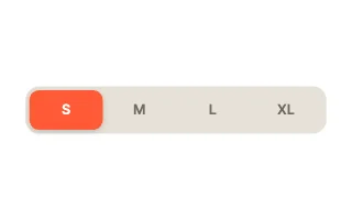
Size SelectorToggle · Segmented & Multi-State
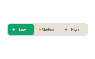
PriorityToggle · Segmented & Multi-State
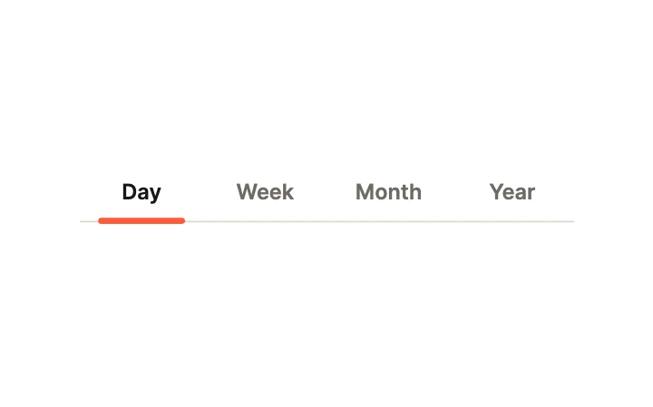
Tab UnderlineRadio group · Segmented
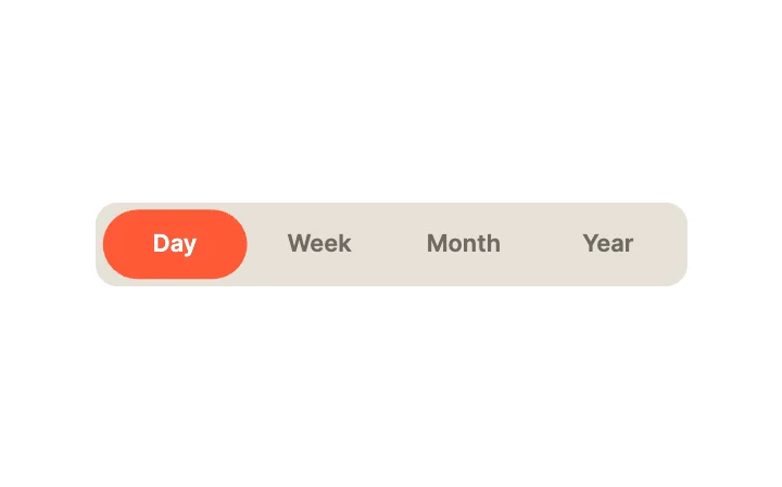
GooeyRadio group · Segmented
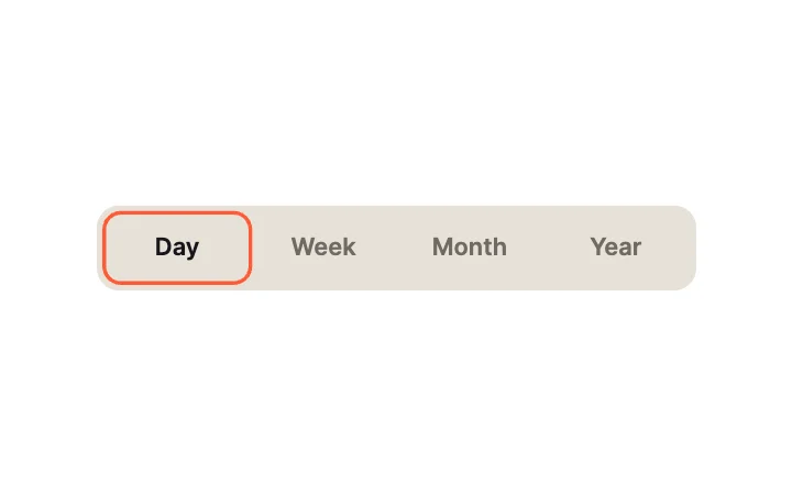
Outline SegmentsRadio group · Segmented
What to look for in a segmented control
- The highlight moves, so the change is easy to follow.
- Labels fit on a phone without truncating.
- The selected index is an input your code owns.
- Two to five options; more belongs in a menu.
Use it in your app
The code for Segmented control, with its real file and input names. Every component on this page works the same way.
npm install exodeuiimport { useEffect } from 'react';
import { ExodeUICanvas, useExodeUI } from 'exodeui';
export function Segmented() {
const { engine, setEngine, updateInput, fireTrigger } = useExodeUI();
useEffect(() => {
}, [engine]);
return (
<>
<ExodeUICanvas src="/segmented.bexode" onReady={setEngine} />
</>
);
}Questions
Is this segmented control free?
Yes. Every design comes from a studio built into the ExodeUI editor, and the studios are part of the free Community plan. You can open and change any design without a paid plan, or download its .exode file from its page. The runtimes are free npm, Swift and Flutter packages.
Segmented control or tabs?
A segmented control switches between views of the same content. Tabs switch between different sections. Both can use the designs here.
How do I read the selection?
The radio group designs report the selected index; the toggle designs report their state. Read either from your runtime.
Which frameworks does it work in?
Each design is one .exode file. The ExodeUI runtimes play the same file in React, Vue, Svelte, Angular, Solid, React Native, SwiftUI and Flutter, and the inputs have the same names in all of them.
Can I change the labels?
Yes. Open it in ExodeUI and every part is a native layer: colours, type, motion curves, springs and logic. The input names stay the same, so code that already uses the design keeps working.
Related
More free components
- Animated UI components
- Interactive UI components
- Animated elements for websites
- Animated React components
- Micro-interactions
- Animated form components
- Dark mode toggle
- Star rating
- Range slider
- Knobs and dials
- Floating label input
- OTP input
- Password input
- Search bar
- Image carousel
- Donut chart
- Line chart
- Pricing table
- Liquid glass UI kit
Make your own in ExodeUI
Free to start. Every studio behind these components is built into the editor, and everything it makes stays native and editable.
Try ExodeUI for free